Available May 2026
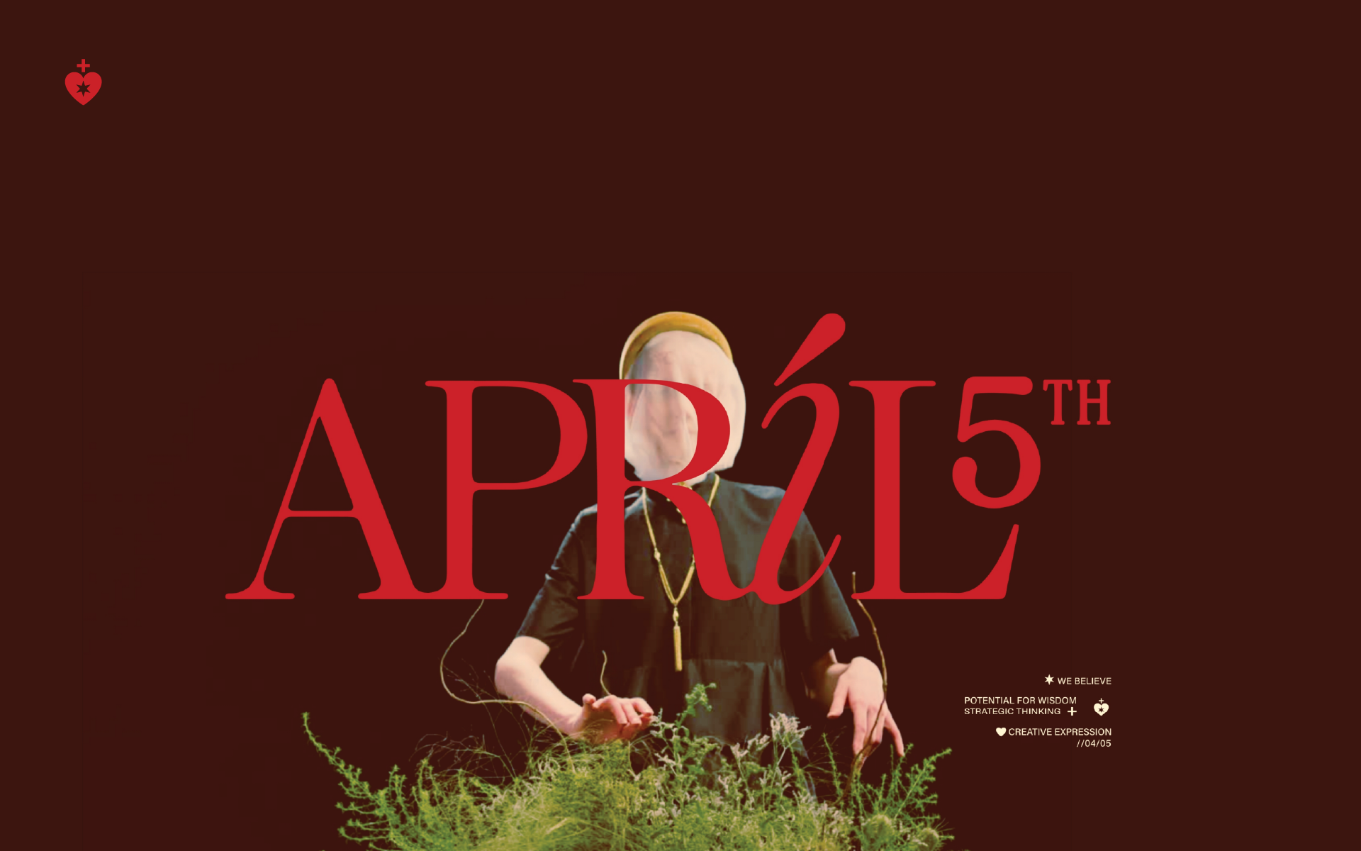
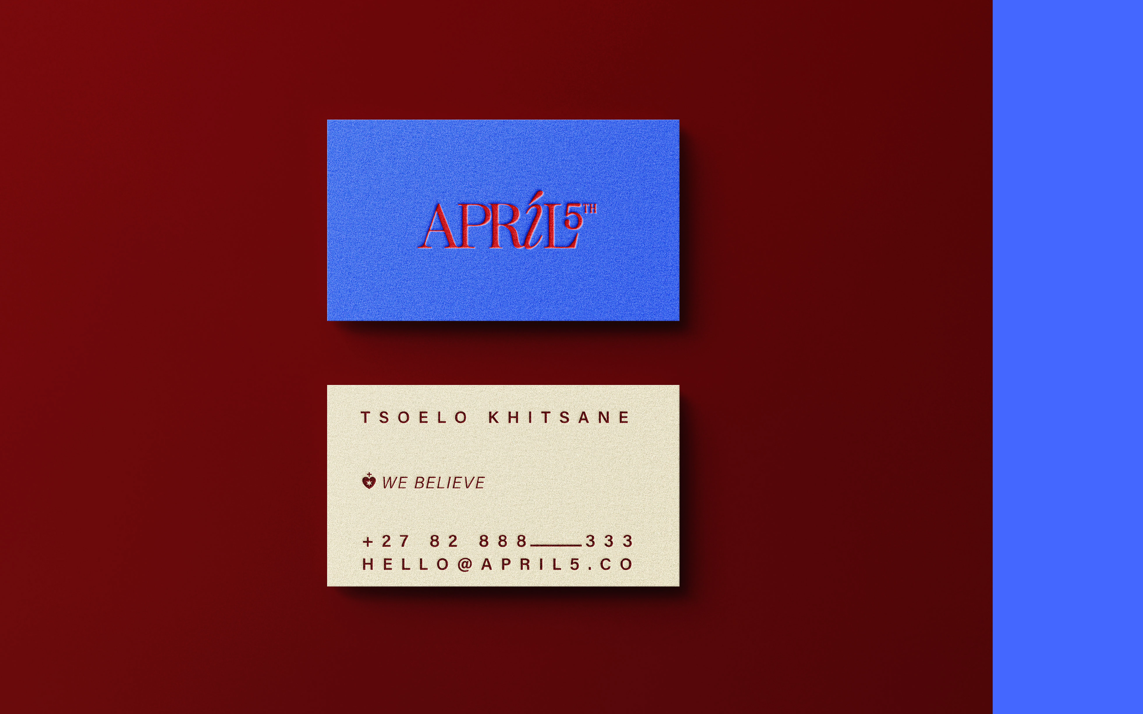
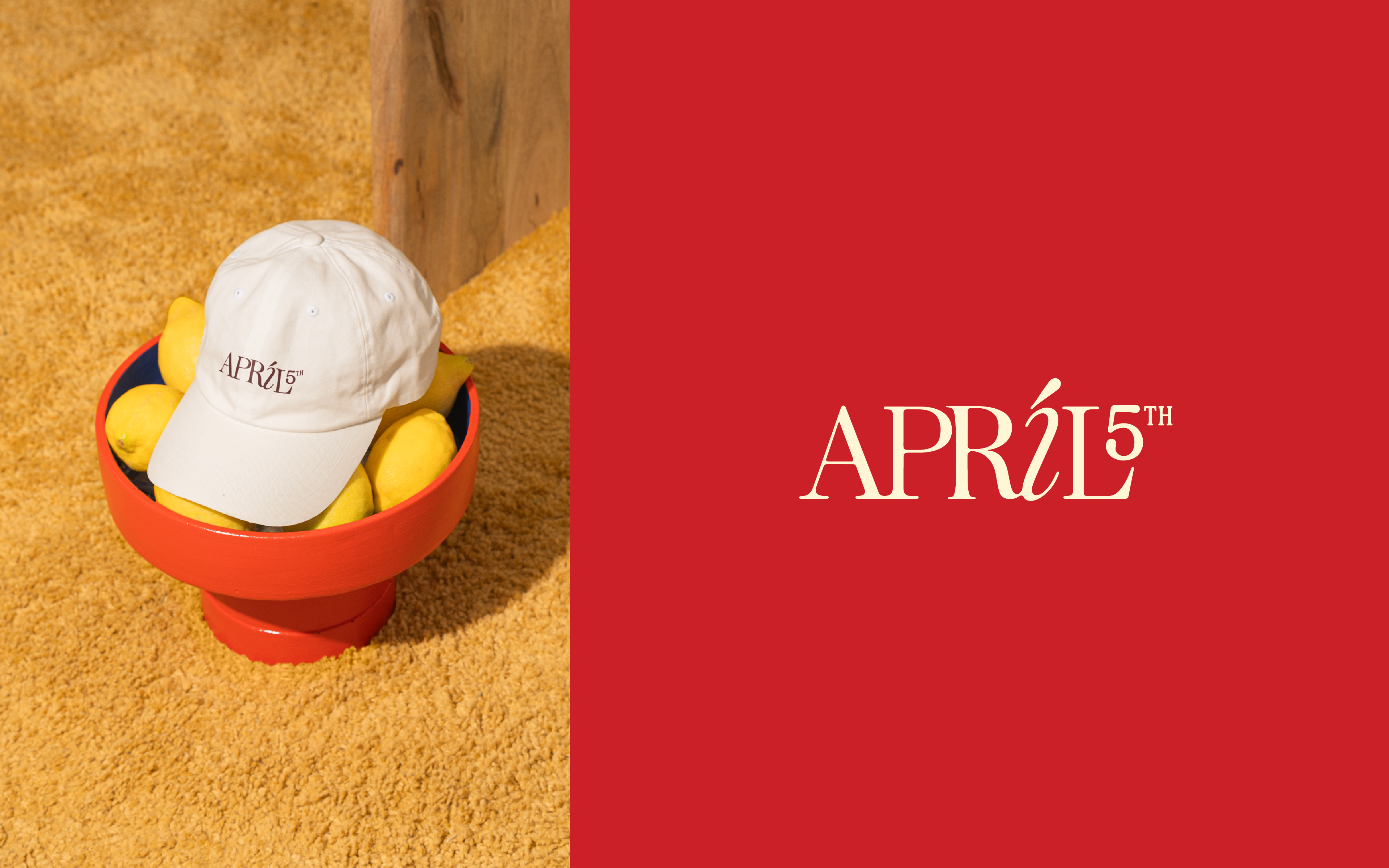
APRIL 5TH
Overview
April 5th thinks with its head and designs with its heart. Named after the day the asteroid Pallas sits five degrees west of Arcturus, the brand draws meaning from the stars: wisdom, creative intelligence, and strategic thinking. We built an identity that treats these not as abstract ideas, but as guiding forces.
We built an identity that finds poetry in precision: a serif with personality, colour with intent, and a mark that turns belief into something you can see. A reminder that even in the rigor of strategy, there’s room for wonder.
Year
2025
Client
April 5th
Services
Branding
/
/

No items found.