
Available May 2026
Kilala
Overview
Flavour with presence.
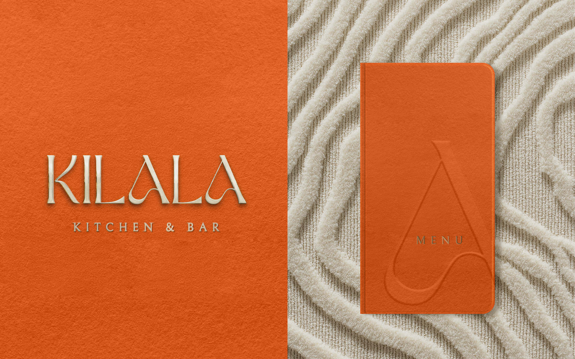
Kilala is a new culinary destination in Pretoria, bringing global flavours into a setting of considered design and understated indulgence. We created the name and brand identity to express its balance of elegance, warmth and ease.
THE CHALLENGE
Set the expectation before the first taste.
The brand needed to introduce a new destination and give people a sense of the experience awaiting them. The task was to communicate refinement while retaining the warmth that makes a restaurant inviting.
THE IDEA
To be known.
Kilala, pronounced “kee-LAH-lah”, carries a sense of intimacy and arrival. It became the foundation for a place with its own presence: somewhere to be seen, remembered and savoured.
THE WORK
Warmth in the details.
Sculptural forms, golden accents and a deep, sun-warmed orange give the identity its richness. Typography balances softness with strength, while textures bring a grounded quality to the expression.
Together, the name and visual language introduce Kilala as a destination where the atmosphere is part of the pleasure.
Luxury with soul.
Year
2025
Client
Kilala Kitchen & Bar
Services
Branding
/
Strategy
/



No items found.