
Available May 2026
Café Cartel
Overview
Global beans. Cape Town attitude.
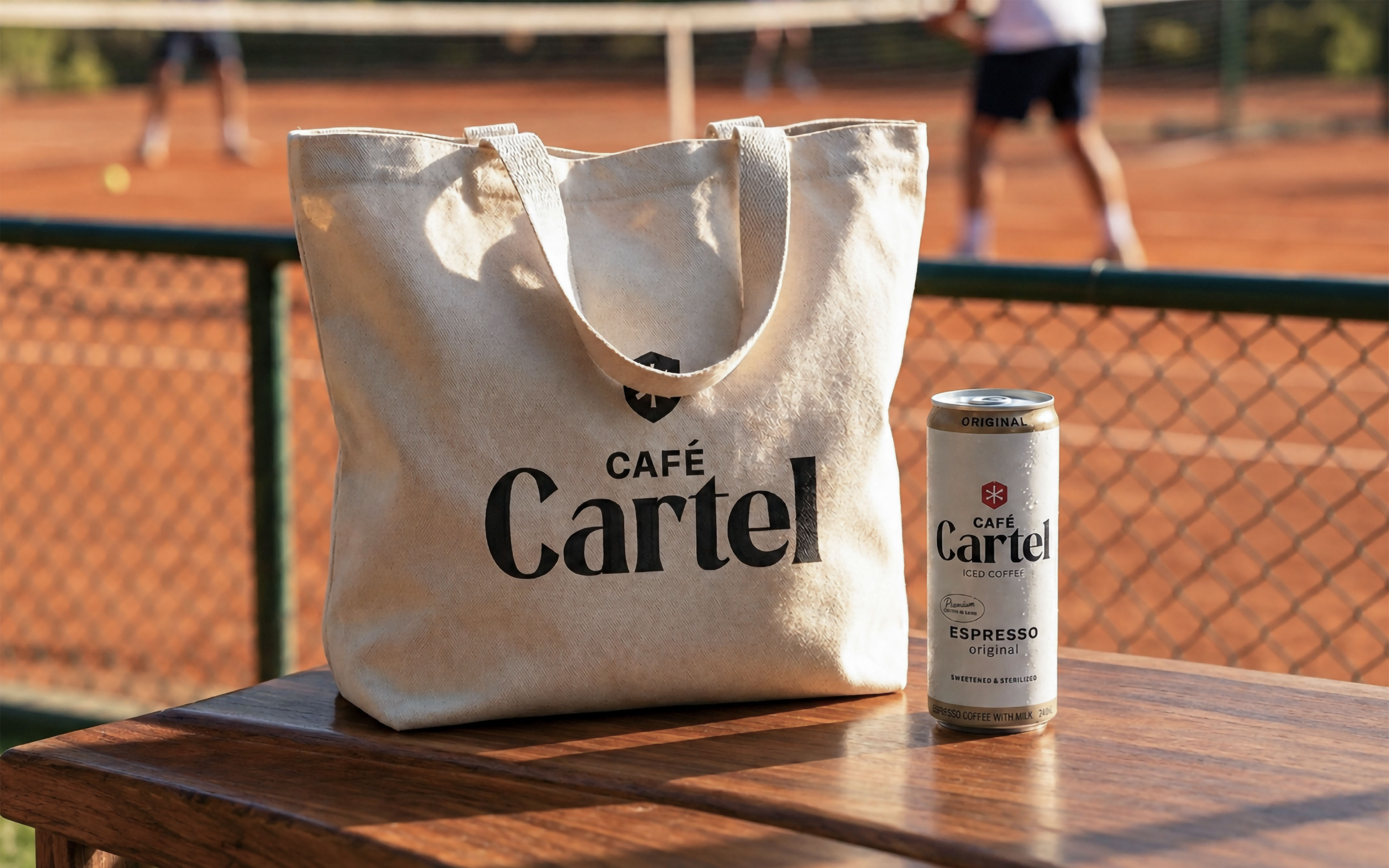
Café Cartel is a premium, espresso-based iced coffee, sourced globally and manufactured in Cape Town. We developed the brand identity and packaging to give the new ready-to-drink brand a clean, confident presence that matches the bold, ice-cold attitude inside the can.
THE CHALLENGE
Make premium easy to spot.
The brief was to create an identity and packaging for a new coffee brand entering the market. It needed to communicate quality, make the product easy to recognise and establish a presence on shelf.
The challenge was to bring those requirements together in an expression with enough character to make Café Cartel recognisable from the outset.
THE IDEA
Clean design. Bold attitude.
Our approach paired a restrained visual language with a confident brand personality. Simplicity became the means of bringing the brand into focus, giving its name and product a clear presence.
THE WORK
A clear identity, carried through to the can.
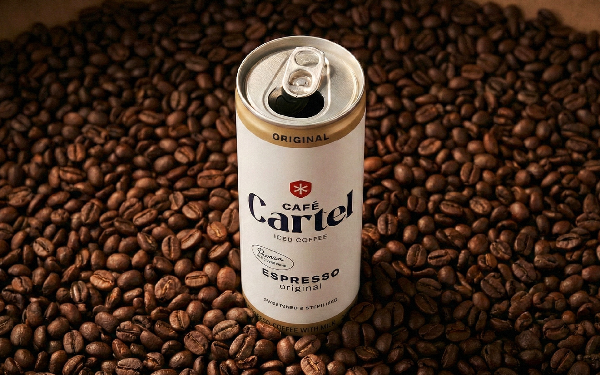
We developed the identity and packaging as one connected system, making the can a central expression of the brand.
The design brings together premium positioning, product clarity and shelf recognition, establishing a visual foundation for Café Cartel’s introduction to market.
Year
*
Client
Café Cartel
Services
Branding
/
/
No items found.


